Feature Friday: Robert Straight
- Forrest.Hines

- Aug 9, 2019
- 3 min read
Updated: Oct 27, 2021
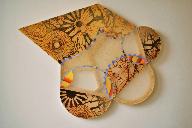
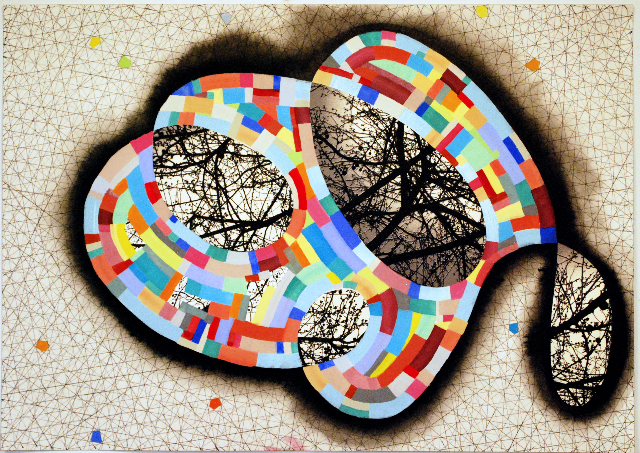
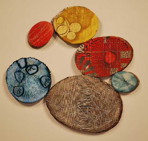
Robert Straight is a painter whose work transcends the fabric of this reality. Straight’s work is an ongoing study of material, color, form and structure both on and off the canvas. He wants to create a new world created by referencing and restructuring elements of our current world. This idea has continued to develop and evolve in Straight’s 40+ years of exhibiting work.
I first got to know Straight in 2014 during my first year at the University of Delaware where he was a professor and, at the time, my advisor. We hit it off right away and I knew instantly that we’d have an excellent relationship during my time at UD… but this didn’t last long as I soon after found out that he’d be retiring at the end of that year. Yet even in my short time working with Straight I could tell that he was an extremely intelligent man who understood art and artists in a way that I hadn’t run into many times before. Straights work has headed down many different paths, even in the time I’ve known him, experimenting with painting on different objects, the way he applies paint, sculpture, and even combining his painting and sculpture. His most recent work is some of the most interesting to me, personally and that’s what I’d like to discuss today, in particular his painting P-615 done this year.
P-615 is a little bit different than Straight’s typical work, abandoning his usual bright colors in loose oblong shapes for a more muted, darker color scheme with a harsher geometry. This is also the most interesting application of a recent material experiment he’s been using, laser cut paper. The design of the paper is derived from study drawings and/or photos that Straight has collected his study of the space around him, I’m not sure that this cut in particular is inspired it but he's referenced a tree that he grew over 20 years ago in a lot of these paper cuts. The cut paper is collaged onto the canvas and painted over top of. You can see that the collaged elements are critical in the application of paint, operating differently with each color. In the black the paper creates this absence of color that feels like a scratch, yet in the gray and red it traps excess color at its edges creating a faux-shadow and pushing the shapes in the paper forward. This effect is compelling in two different ways, first is because it’s the same material but it’s creating two totally different effects that emphasize two different elements of the paper. The scratch like texture in the black pushes forward the lines of the paper where the shadow effect in the other colors pushes the shape. The other compelling nature of this effect is in the transitions, while the color shifts from black to gray or black to red rather abruptly the more organic nature of the paper shape allows for seamless transitions from one effect to the other. This piece has a ton of depth to it and is something that hasn't really been pushed or pursued in Straight’s work before, from what I’ve noticed.
Straight has an expansive portfolio (some of which is referenced in the slideshow at the beginning of the article) and you can look into that more on his site, http://robertstraight.com/ or his Instagram @robertstraight5436. Straight is represented by Schmidt/Dean Gallery in Philadelphia where he had a solo show this year and he’s got another solo show coming in 2021 at Holtzman Gallery on Towson University’s campus. I’ve also included a neat little video interview that Straight did with WHYY about his work. Straight is an ever growing, developing and experimenting artist that is certainly worth a check out!


Comments